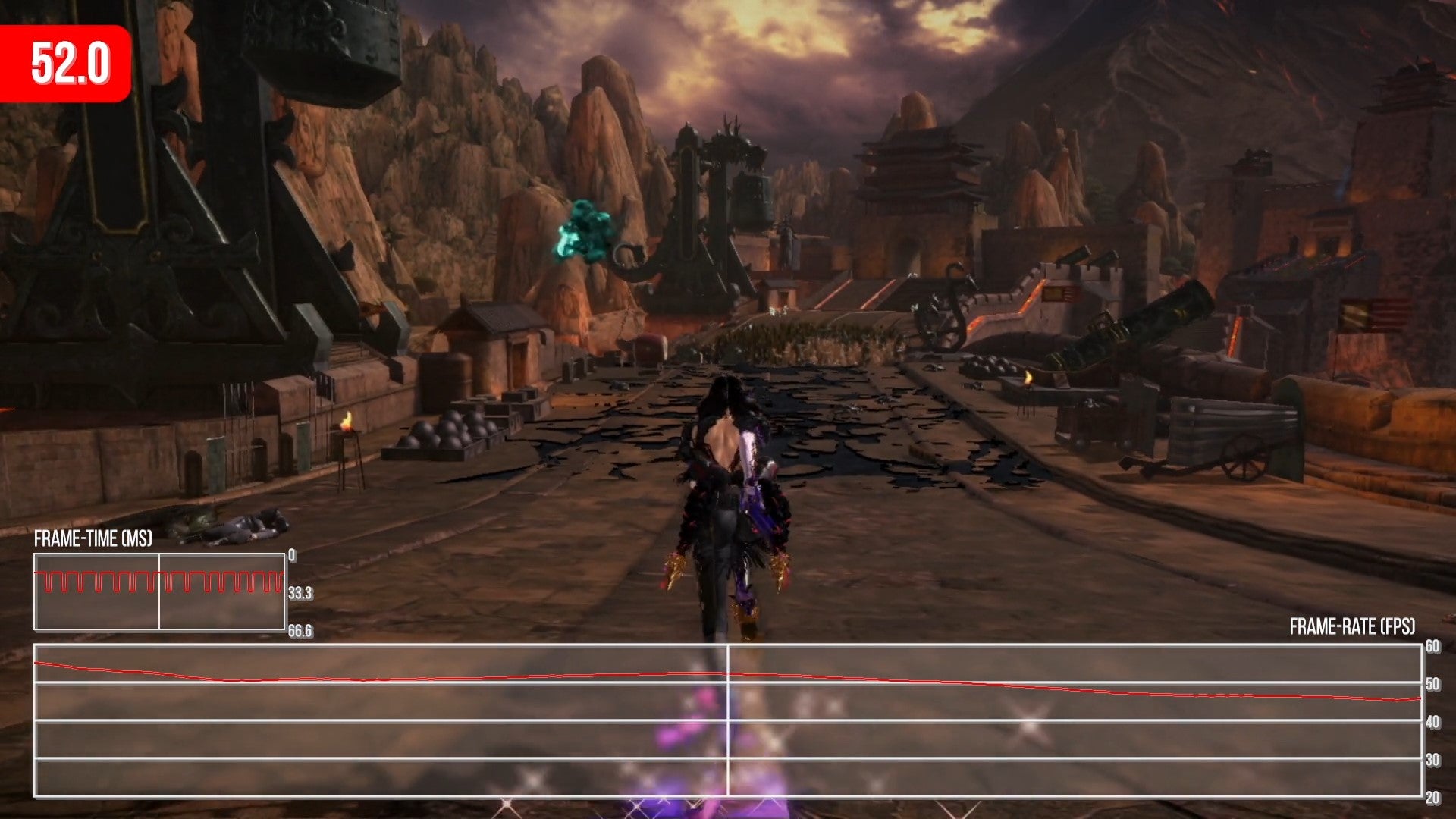
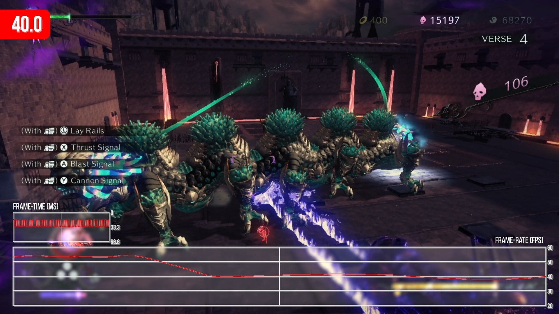
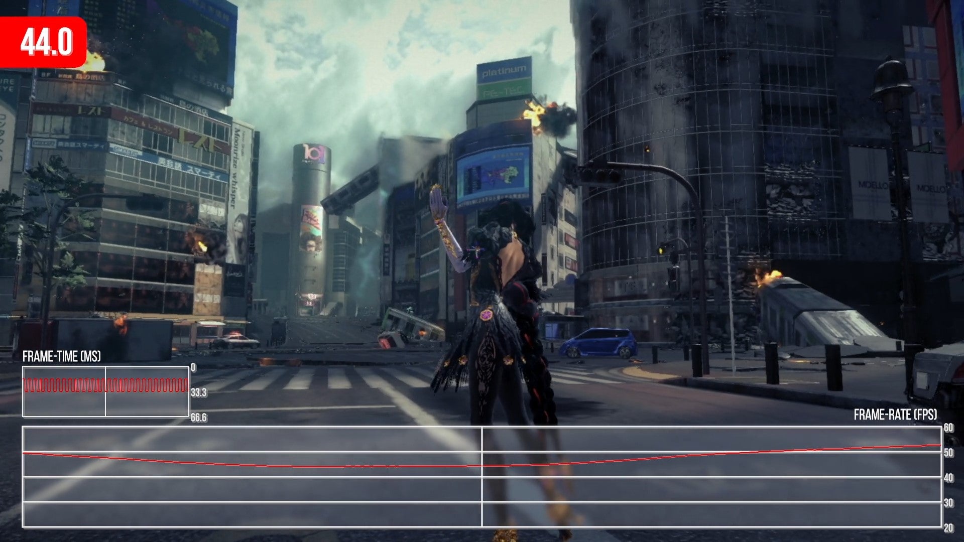
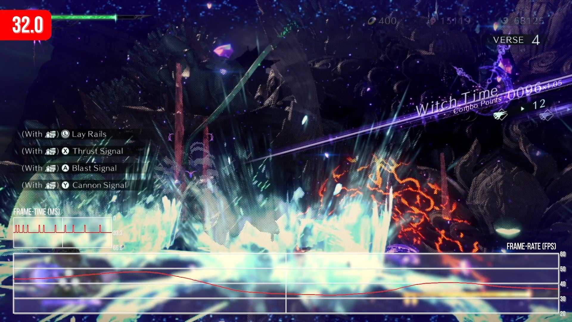
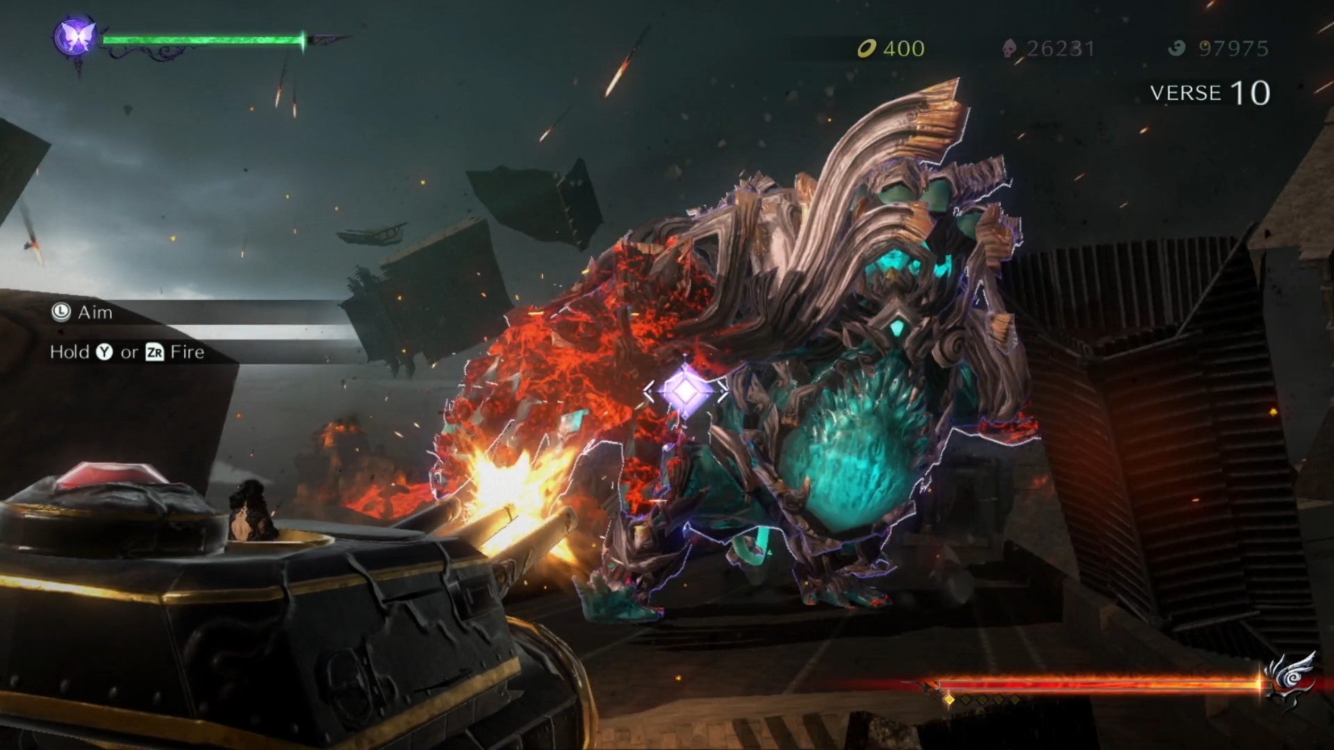
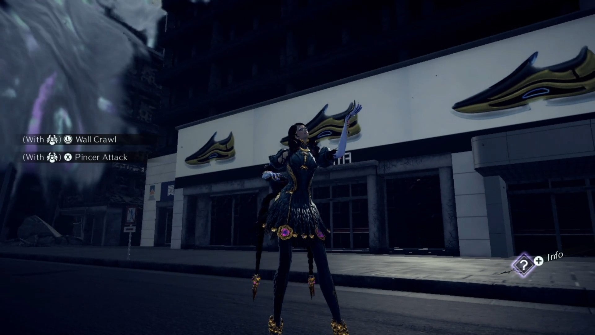
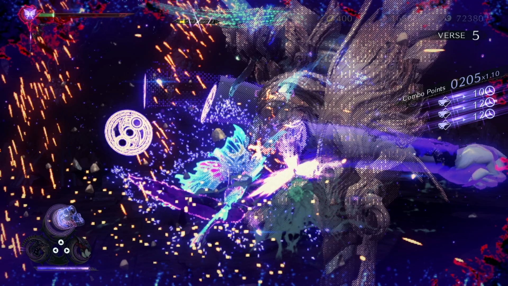
Let me make this clear - Bayonetta 3 is a fantastic action game and one that should satisfy fans of the series. Its bombastic set pieces, varied stage design and wildly out of control storytelling all work in tandem to create something uniquely special. However, the game also reveals an aging technology base that crumbles under the weight of its scope and scale. This is a game where it feels as if the entire production is in search of more powerful hardware that has never arrived. After playing the latest game, I’ve been thinking of its beginnings. The original Bayonetta is fast, fluid and bursting with ideas. It was never a technical masterpiece but, for its day, it was a beautiful game. Years later, we were treated to the majesty of Bayonetta 2 - first on Wii U then on Nintendo Switch. Bayonetta 2 feels like a logical next step both gameplay-wise and visually. Again, it’s not cutting-edge, but it feels well situated within the context of its target platform. For me, Bayonetta 3 fails to meet the realistic expectations set by the first two titles in the series. Bayonetta 3 is a huge game - there’s no doubt about it - and the scale and scope of the game world has been violently expanded, resulting in a wild experience involving the multiverse, multiple playable characters and a smorgasbord of Bayonettas. The enemies are larger, the set pieces more extreme and the sheer number of ’things to do’ has expanded significantly. Combine this with the stunning soundtrack and there’s no doubt that there is something special here. However, then we get to the visuals. As a retro gaming enthusiast, I regularly enjoy games that most modern gamers would describe as ‘ugly’ or ‘dated’. Equally, I love seeing developers work within the constraints of the Nintendo Switch hardware. To put it simply, Bayonetta 3 can look great at times but more often than not, there’s a feeling that the art design doesn’t necessarily jive with the technical reality. Textures are often low resolution and muddy in appearance, image quality is sub-par, and performance is remarkably unstable. It fares worse than every other Bayonetta release save for the PS3 version of Bayonetta 1 - and that’s a bummer. I suppose the best way to describe the presentation is simply - inconsistent. The visuals range from beautiful to downright ugly depending on the chapter you find yourself in. Looking at all three games, I feel that my impression of the third entry stems from an increase in the scale of everything, along with key artistic decisions. In the first game, Bayonetta engages foes at variable scale - most of the game revolves around battles with enemies of comparable size to the titular hero. Sometimes these take place within walled-off arenas while other battles occur organically along the main path. At various junctions, you’ll face off against what I call ‘mid-bosses’ - larger foes that require additional strategy and finesse to defeat. They’re often several times larger than Bayonetta herself and help spice up the level design. Lastly, there are the massive, screen-filling bosses - these specific events ask you to whittle down huge life bars while facing gigantic enemies. Bayonetta 2 builds on this concept but tends to feature more boss battles at regular intervals but with Bayonetta 3, there’s a sense that the small-scale minion enemies, appear with less frequency and with fewer variations. The average battle takes place at a larger scale instead while mammoth-scale bosses appear regularly as well. This results in two big changes - firstly, environments are scaled up. Arenas are much larger than prior games in the series and feature less granular detail as a result. Secondly, the camera spends far more time zoomed out from the action in order to ensure the player can actually see what they’re fighting. The scale of these battles are often magnificent fun - there’s a sense that Platinum wanted to one-up themselves with this game and push things to the next level but perhaps went too far. The camera often zooms way out from the action and, more annoyingly, it clips through enemies and scenery regularly. In the originals, these objects used alpha transparency when the camera passed through a solid surface - in Bayonetta 3, however, likely to save on fill-rate, Platinum leans heavily on dithering. Think Sega Saturn and its notoriously dodgy transparencies and you have a good idea how they look - it’s basically stippled alpha and it’s everywhere. You’ll see it constantly during fights and even just within the environment and it never looks very good. Overall image quality is fairly limited as well - the series isn’t exactly known for high resolutions. Bayonetta 2, in fact, was limited to 720p even on Switch. Bayonetta 3 does improve upon this slightly with an increase in pixel count to 810p. Portable mode falls below 720p, however, unlike the prior games - pixel counts suggested a resolution just below 480p so it’s not exactly sharp there either. can forgive this given the frame-rate target but the low pixel count, large environments and low quality texture filtering aren’t exactly a great pairing. The environments, though, are the weirdest thing to me - the game is often surprisingly drab. The entire Tokyo section is slathered in monochromatic textures and non-existent lighting. I don’t expect high-end real-time lighting here, mind you, but I feel like the original games did a better job with their pre-calculated lighting setup. That said, there are still some beautiful environments, but there are far more levels that simply disappoint in terms of visual quality and overall consistency is locking. What I will say is that Platinum nails the spectacle - if you consider the tiered combat I mentioned earlier, Bayonetta 3 basically goes one step above screen-filling boss battles. Building so many of these bespoke action sequences could not have been cheap or easy - there’s a lot of custom animation and camera work throughout which is mighty impressive. This is equally true of the cutscenes - at least for the most part. As is tradition for the series, cut-scenes drop the frame-rate to 30fps and ramp up the visual quality. This remains the case in Bayonetta 3. There is one catch, however, while many of the cutscenes are rendered fully in real-time, as was the case in prior games, certain sequences are now displayed as video clips with obvious compression artefacts, as clear as day. The entire introduction sequence, for instance - a staple of the series - is no longer a real-time cutscene. At least the transition between video and real-time is seamless. My feeling is that Bayonetta 3 is a solid action game with some impressive set-pieces let down by underwhelming visuals and mild camera issues. As long as the frame-rate is solid, it would be easy to look past the presentation issues but, alas, the reality isn’t quite what I had hoped. Cutscenes do indeed retain the target 30 frames per second, as you’d hope, so nothing is amiss there. Surprisingly, for the larger set pieces, actual gameplay is updated at 30fps as well - it’s clear that the scale of these scenes made 60fps impossible, so they’re simply capped instead. That’s understandable but standard gameplay rarely touches the 60fps threshold and that’s a real problem. Even empty rooms fall to hit the target frame-rate which means that once you drop into combat, it’s basically just an unlocked, unstable experience throughout. Most battles in the game struggle to reach 60 - you’d be hard pressed to find even a single fight that runs with any degree of stability. As a result, it winds up feeling sloppier than I had hoped. It’s much less fluid than the prior two games, disregarding the awful PS3 port of the first Bayonetta, of course. It’s for these reasons I feel that perhaps Platinum went a little too far this time - at least based on the onerous constrictions of the Switch hardware. It reminds of The Wonderful 101 on Wii U, in fact, which exhibited similar performance problems with only rare moments of a smooth 60fps experience. So, if you were OK with the performance in that game, you’ll have little issue with Bayonetta 3. For my tastes though, it’s just not good enough. From a personal perspective, Bayonetta 3 fell short of expectations but I should make it clear that despite the poor technical performance, there’s still something special about this release - but I honestly feel that the game perhaps would have worked best as a launch title for the upcoming Switch successor. Given Platinum’s history with porting games, an upgraded version for a next generation Switch could be a possibility but for now, this large-scale action adventure demands some flexibility from the player if you want to enjoy it. My feeling is that Platinum’s technology really needs a full revamp. Maintaining inhouse technology is challenging and expensive, of course, and what they’ve achieved here is still impressive given that but it doesn’t feel like it plays to the strengths of the Switch hardware. Temper your expectations on the tech side and you’ll have a good time with Bayonetta 3 but if unstable frame-rates and inconsistent visual quality bother you, perhaps this isn’t the game for you.
